Branding & WebsiteStay in Medicine HatWe worked with the Medicine Hat Accommodation Association to give their old site a beautiful redesign and more. All of which was designed with the future in mind, as the site is easily manageable throughout. |
 |
 |
A Polished LookThe most noticeable change was the design, which we made simple & clean. Many of the similar websites visitors might come across were stressful to navigate through, which was an experience we strived to avoid.
|
 |
 |
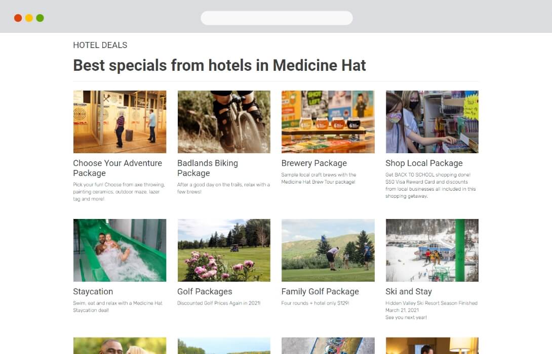 |
Easy to Manage Page LayoutsTo reduce the time needed to make new pages, and modify existing ones, we created a template system for the content areas throughout the website. These could be easily copied, adjusted, and updated , minimizing the time needed to keep the new website fresh with new deals. |
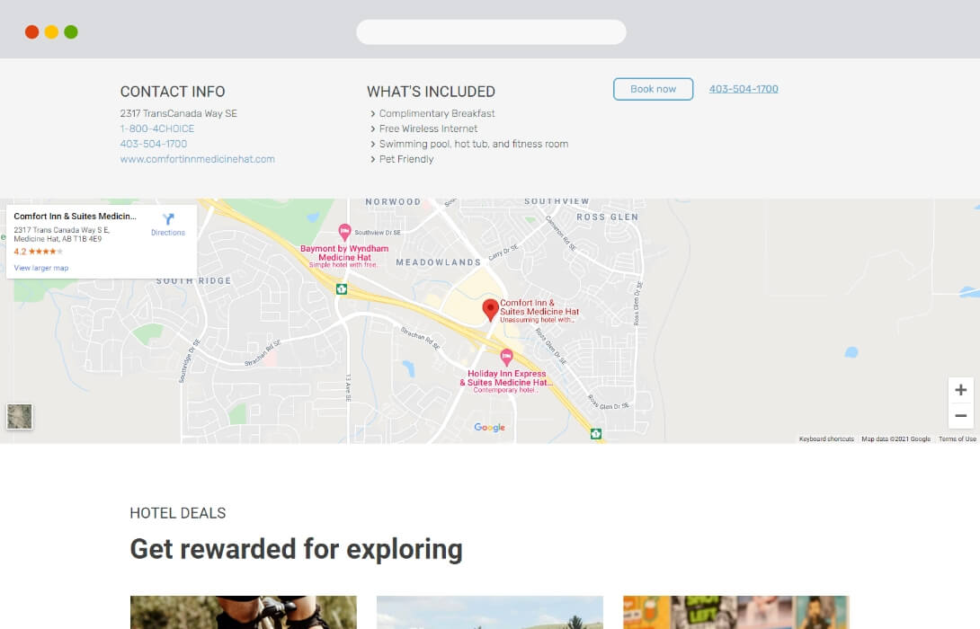 |
 |
Simplicity is KeyModern sites that work well due to their simplicity for users. This was a model that we applied throughout each page, making it as easy as possible for users to navigate, read, and engage with the site content. |
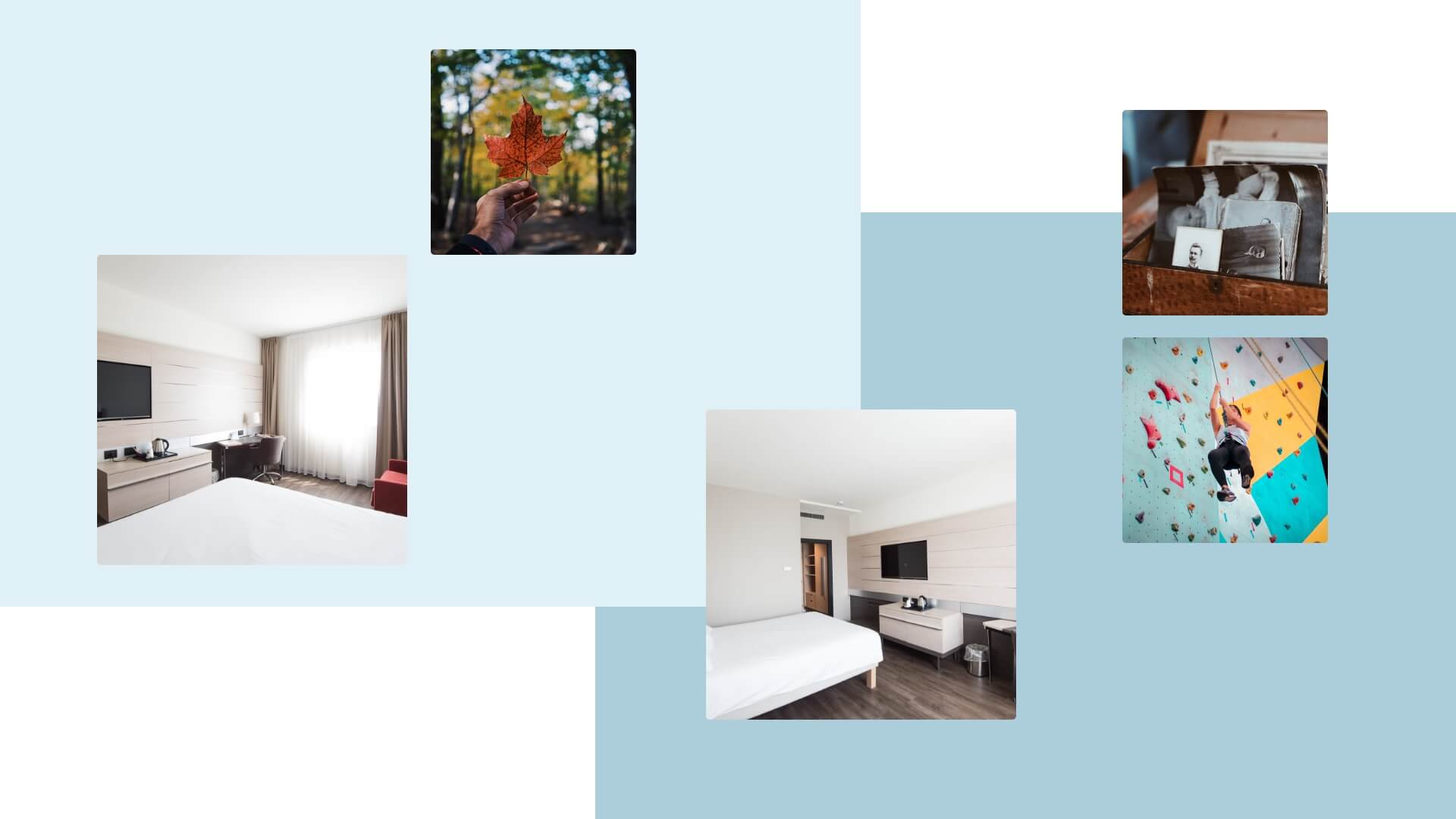
Looking for DealsFrom initial conversations about a new site, to building out the finished product - we had the end user in mind during every stage. The new Stay In Medicine Hat website is a reflection of the needs and wants for the travellers that make their way through the area. |
 |
|
Optimized the Right WayGetting the new site optimized for Search Engines involved combing through each article, page, and landing page - ensuring the text, visuals, and meta information was properly formatted. Although this was a laborious process, it’s one that we always recommend, as the results become clear after several weeks of going live. |


